Announcing Pantone’s Color Of The Year 2022:
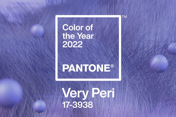
Pantone 17-3938 Very Peri
A new pantone color whose courageous presence encourages personal inventiveness and creativity. 2022 marks the first time a color has been custom created for the Pantone Color of the Year program. Very Peri blends the faithfulness and constancy of blue with the energy and excitement of red to introduce an empowering mix of newness to apparel, beauty, home furnishings, product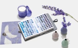 design, and packaging. Click here to learn more about how color is affecting you office.
Evocative of a new modernity, Pantone Very Peri injects a sense of playful freshness into corporate interiors, enlivening a space through unusual color combinations. A versatile shade that animates our creative spirit, Very Peri is suited to an array of different materials, textures, and finishes, providing a pop of color whether introduced through a painted wall, statement furniture or home décor, or acting as an intriguing and eye-catching accent in a pattern.
Displaying a carefree confidence and a daring curiosity that animates the creative spirit, inquisitive and intriguing Very Peri helps to embrace this altered landscape of possibilities, opening us up to a new vision as we rewrite our lives. Rekindling gratitude for some of the qualities that blue represents complemented by a new perspective that resonates today, Very Peri places the future ahead in a new light.
Very Peri is also a symbol of the time we’re in and the transition we are going through. As we emerge from an intense period of isolation, our notions and standards are changing, and our physical and digital lives have merged in new ways. Digital design helps us to stretch the limits of reality, opening the door to a dynamic virtual world where we can explore and create new color possibilities. With trends in gaming, the expanding popularity of the metaverse and rising artistic community in the digital space Very Peri illustrates the fusion of modern life and how color trends in the digital world are being manifested in the physical world and vice versa.
“The Pantone Color Of The Year reflects what is taking place in our global culture, expressing what people are looking for that color can hope to answer.” added Laurie Pressman, vice president of the pantone color institute, “creating a new color for the first time in the history of our pantone color of the year educational color program reflects the global innovation and transformation taking place. As society continues to recognize color as a critical form of communication, and a way to express and affect ideas and emotions and engage and connect, the complexity of this new red violet infused blue hue highlights the expansive possibilities that lay before us”.
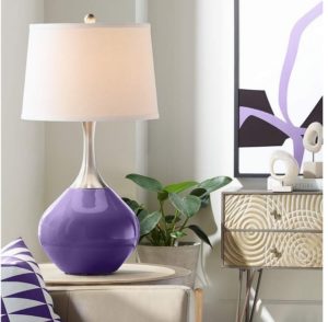 Having an experienced design team to work with you every step of the way, as you will have when you work with Davies, creates a dynamic presence that encourages courageous creativity and imaginative expression. We create fully customized workspaces for our clients to their exact needs and wants. So whether it’s a full-on Very Peri color scheme, or just a few accent pieces, Davies has your back. Click here to learn more about our design process and give us a call at 58.449.2040 to start your next revamp.
